Thursday, 19 December 2013
Sunday, 17 November 2013
ArtOrder Inspiration Challenge - Process
When I heard about ArtOrder's Inspiration Challenge, I jumped aboard. This was a VERY open and fun challenge. You basically illustrate anything that inspires you. I ended up illustrating something that inspires a lot of my art, which is aquatic scenes and creatures. I've always loved the water; From pretending I was a mermaid when I was a kid to scuba diving which is now one of my main hobbies besides art making, so it's pretty fitting.
Figuring out which inspiration to focus on was tricky though! So many things popped into my head: fairy tales (Peter Pan in particular), art nouveau, trees/nature, Artists like Arthur Rackham, Dulac, Klimpt, John Bauer, Kay Nicholson, Waterhouse, and a billion more, water, flying, fantasy creatures, flowy hair, Greek myths, and on and on... I really didn't know what to do, there were too many ideas floating around. Here are a few idea scribbles:
I took a last step of finishing it off digitally. It's the best of both worlds. I love traditional but I also love digital. Since I'm not where I want to be yet with my watercolors, it's nice to have the option to finish it digitally. It's also faster (no drying time) and I was running short on time. I took some inspiration from a Muddy Colors blog post that Justin Gerard did where he uses a similar process.
Overall, I'm pretty happy with it. If it gets picked to be a part of the ArtOrder book that would be awesome! But if not, that's ok too. I learned a lot during the making of this painting and continuing to learn and grow as an Artist is the most important thing.
Figuring out which inspiration to focus on was tricky though! So many things popped into my head: fairy tales (Peter Pan in particular), art nouveau, trees/nature, Artists like Arthur Rackham, Dulac, Klimpt, John Bauer, Kay Nicholson, Waterhouse, and a billion more, water, flying, fantasy creatures, flowy hair, Greek myths, and on and on... I really didn't know what to do, there were too many ideas floating around. Here are a few idea scribbles:
After 2 false starts (I actually finished a whole painting but decided not to use it for the challenge), I finally decided on the underwater/mermaid theme. I also threw in an old gnarly tree (love drawing those). I did some rough thumbnails to help decide on a composition/pose. Here are a few of them:
I then collected some reference and drew a sketch on some watercolor paper:
I inked it with a brush and some pens:
Next came the watercolor. One book that I ended up flipping through to give me some ideas for the this stage was "Dreamscapes: Creating Magical Angel, Faery & Mermaid Worlds in Watercolor" by Stephanie Pui-Mun Law. It has some great little watercolor tutorials in there.
Here's how the watercolor turned out:
Overall, I'm pretty happy with it. If it gets picked to be a part of the ArtOrder book that would be awesome! But if not, that's ok too. I learned a lot during the making of this painting and continuing to learn and grow as an Artist is the most important thing.
Labels:
ArtOrder,
Challenge,
illustration,
inking,
Jon Schindehette,
Justin Gerard,
mermaid,
Michelle Papadopoulos,
process,
sketch,
sketches,
Stephanie Pui-Mun Law,
thumbnails,
underwater,
watercolor,
WIP
Saturday, 16 November 2013
Etsy Store
I now have an Etsy Store! https://www.etsy.com/shop/MichellePapadopoulos
After taking part in Inktober and creating all those ink drawings, I thought it might be a good idea to sell some of them. I had a blast creating them and people seemed to like them so why not!
Eventually, I'm going to also put up prints and paintings but for now, my ink drawings will have to do.
Friday, 25 October 2013
More Inktober
This month has been super inspiring. I've been having a ball working on these ink drawings daily (well almost daily; I missed a couple). Here are a few more. I'm thinking of opening an Etsy shop and selling some. We'll see!
Saturday, 12 October 2013
These ink drawings for Inktober are so much fun to create! I really love working with ink. Ink and watercolor are something I really want to get more into. I feel like my whole outlook on making art has been changing the past few months (well probably since IMC). I'm really interested in a different style than anything in my portfolio right now. I will have to create a whole new portfolio eventually with the kind of work I like to do now. And I'm still figuring that out...
Here's a video I created of one of the Inktober drawings. It was a pretty quick and fun video to make since I didn't have to speak in it (yay!). I screw up a lot when I have to speak. I hope to make more of these!
Here's a video I created of one of the Inktober drawings. It was a pretty quick and fun video to make since I didn't have to speak in it (yay!). I screw up a lot when I have to speak. I hope to make more of these!
Sunday, 6 October 2013
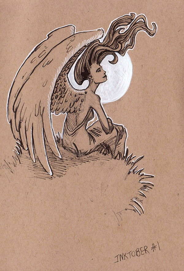
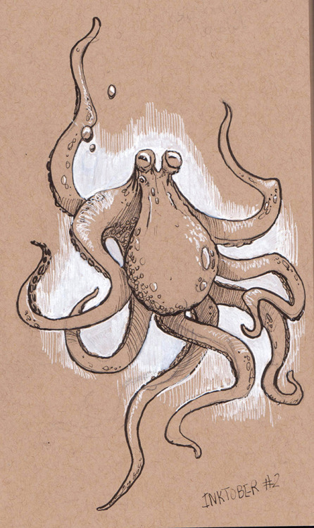
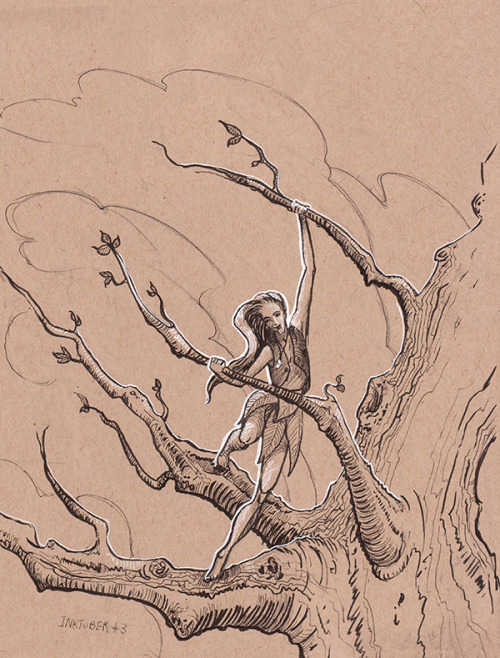
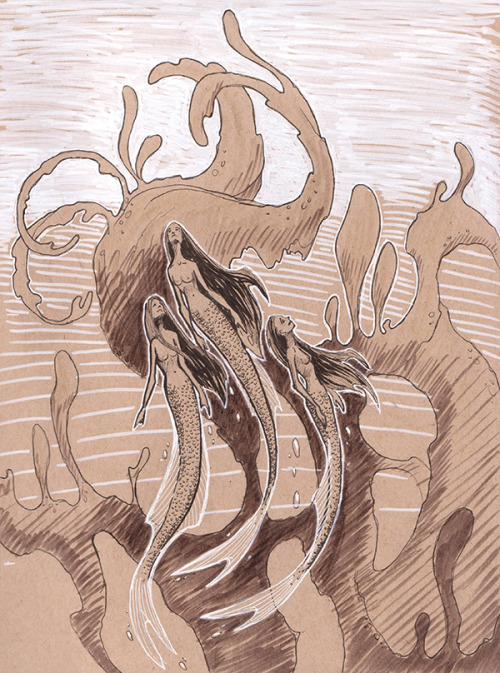
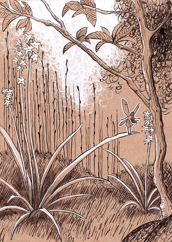
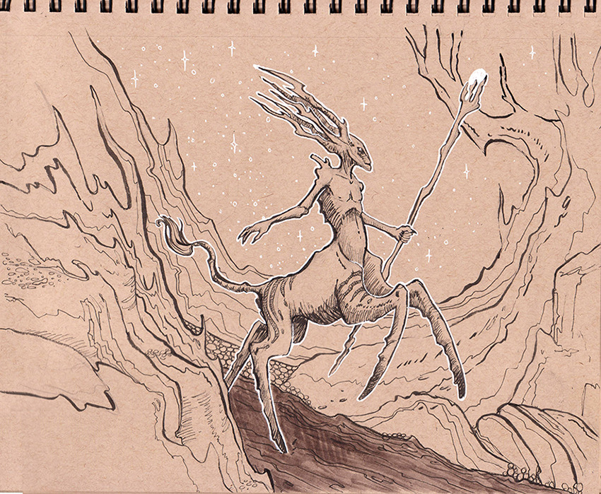
Inktober
It's Inktober! I jumped on the bandwagon a bit late (hadn't even heard about it before) but I did 3 ink drawings the first day to make up for it. It's a lot of fun so far! I have been interested in doing more ink work and more traditional work in general, so this was a great opportunity to get motivated and jump right in.
I'm trying to free my mind and draw whatever I want without thinking too hard about it. My creativity sometimes gets killed by over-thinking things; For example: Would other people like this? What should I have in my portfolio if I want to illustrate for X or Y? Maybe I should have more of this or that in my portfolio, it has to be PERFECT! (and it never ever is)... Those kind a things.
So, none of that!! I will just draw whatever is in my head at that moment. I think this will give me a better idea of what I really love to draw because I have had trouble figuring that out.
Here is my arsenal: various pens, markers, and inks. I love the look of toned paper with black and white ink. I also bought a couple "fancy" inks, one in gold and one that has an iridescent green shimmer to it. While I was at IMC in June, I bought a Winsor & Newton Series 7 Sable brush and I can't say enough how much I love it! It is a little pricey but it should last for quite a while. You can paint a line that is about a centimeter think to as thin as a hair with it, no problem.
I'll be posting them all on my Tumblr.
Here are the first 6 sketches:
Here are the first 6 sketches:
More to come!
Friday, 19 July 2013
My IMC 2013 Painting Process
The Illustration Master Class happened in the middle of June; sorry for the delay!
It was my second year at IMC and it was amazing just like the first. Although this time I knew what to expect, I felt more organized, and actually knew people this time! It was great seeing friends from last year and meeting new ones. So many fun things happened throughout the week that it would take many posts to cover it all. This post is mostly about the painting I was working on throughout the week. For more thorough IMC 2013 coverage, head on over to Christopher Burdett's blog; he created a post for each day, which is awesome. Also, James Gurney created a great video during the days he was there.
We had to choose out of a selection of assignments to illustrate which were sent to us about a month before IMC started. We had to show up prepared with some thumbnails and a sketch of what we wanted to work on for the week. Out of all the assignments, I picked "A Midsummer Night's Dream". I drew up some thumbnails for 2 of the scenes. Below are a few from the scene where Oberon puts the "love potion" into Titania's eyes as she sleeps and also the scene when she wakes up and is about to see Nick Bottom for the first time (and then falls in love with him even though he's a man with a donkey's head).
I ended up going with the second scene and created a sketch of my favorite thumbnail:
I had my crit with Rebecca Guay, Greg Manchess, and Mike Mignola. I got some great feedback on tweaks to make. Luckily I didn't have to make any huge changes. I drew up a final sketch that I could continue to work from:
My plan was to scan in the sketch and create my painting digitally like the previous year but things took a different turn... On the first day, I set up my station in the digital studio with my new Cintiq and was ready to go for the week. I mentioned to a few instructors that I might want to try a different style focused more on the line work (think Arthur Rackam-ish vibe). Iain McCaig suggested I tryout inking and watercolor and said he'd do a demo for me - how could I say no to that!! I've been wanting to learn watercolor for a while; what a perfect opportunity to learn from such an inspiring Artist!
At around midnight on day 2, I believe, Iain did a demo using Nick Bottom as a subject. He sketched it out using donkey photo reference and one of the students for the facial expression; it was entertaining! He then inked it using India ink and his trusty series 7 sable brush. After it was dry, he broke out the watercolors and let me try as well. I thought I'd destroy it! Almost did, but it was less scary the more I tried it out.
I headed to an art store the next day with a couple classmates and bought some India ink and fancy small series 7 sable brush. And I spent most of the day inking. I found I could get a HUGE range in line width with the brush as compared to a brush pen. I definitely want to use a brush and ink more in the future.
The teachers and students that I asked, seemed to mostly like the top left the best. That one and the bottom right were my picks so I went with top left.
I just went for it and did the best I could. I'm pretty happy with how it turned out for a first full watercolor painting. It was a lot of fun so I hope to do more!
Some other IMC highlights:
- Just hanging out with everyone and geeking out over art stuff; the group of people who attend and teach are so awesome.
- All of the lectures. There were 2-3 lectures a day and we learned so much it's hard to process it all!
- Checking out Mike Mignola's portfolio of original inked art.
- Watching everyone's paintings take shape; there were so many great ones!
- Watching painting demos by the faculty.
- Getting advice on my graphic novel story from Scott Allie.
- And basically everything else!...
For more photos, you can check out my IMC 2013 album on Facebook.
Thanks to Gene Snyder for the demo photos!
It was my second year at IMC and it was amazing just like the first. Although this time I knew what to expect, I felt more organized, and actually knew people this time! It was great seeing friends from last year and meeting new ones. So many fun things happened throughout the week that it would take many posts to cover it all. This post is mostly about the painting I was working on throughout the week. For more thorough IMC 2013 coverage, head on over to Christopher Burdett's blog; he created a post for each day, which is awesome. Also, James Gurney created a great video during the days he was there.
The dream team faculty
Back: Scott Allie, Scott Ficsher, Greg Manchess, Irene Gallo, Rebecca Guay, Julie Bell, Boris Vallejo
We had to choose out of a selection of assignments to illustrate which were sent to us about a month before IMC started. We had to show up prepared with some thumbnails and a sketch of what we wanted to work on for the week. Out of all the assignments, I picked "A Midsummer Night's Dream". I drew up some thumbnails for 2 of the scenes. Below are a few from the scene where Oberon puts the "love potion" into Titania's eyes as she sleeps and also the scene when she wakes up and is about to see Nick Bottom for the first time (and then falls in love with him even though he's a man with a donkey's head).
I ended up going with the second scene and created a sketch of my favorite thumbnail:
I had my crit with Rebecca Guay, Greg Manchess, and Mike Mignola. I got some great feedback on tweaks to make. Luckily I didn't have to make any huge changes. I drew up a final sketch that I could continue to work from:
My plan was to scan in the sketch and create my painting digitally like the previous year but things took a different turn... On the first day, I set up my station in the digital studio with my new Cintiq and was ready to go for the week. I mentioned to a few instructors that I might want to try a different style focused more on the line work (think Arthur Rackam-ish vibe). Iain McCaig suggested I tryout inking and watercolor and said he'd do a demo for me - how could I say no to that!! I've been wanting to learn watercolor for a while; what a perfect opportunity to learn from such an inspiring Artist!
At around midnight on day 2, I believe, Iain did a demo using Nick Bottom as a subject. He sketched it out using donkey photo reference and one of the students for the facial expression; it was entertaining! He then inked it using India ink and his trusty series 7 sable brush. After it was dry, he broke out the watercolors and let me try as well. I thought I'd destroy it! Almost did, but it was less scary the more I tried it out.
I learned a ton; Thanks Iain!
I headed back to the digital room to do up some color comps.
The teachers and students that I asked, seemed to mostly like the top left the best. That one and the bottom right were my picks so I went with top left.
I just went for it and did the best I could. I'm pretty happy with how it turned out for a first full watercolor painting. It was a lot of fun so I hope to do more!
Some other IMC highlights:
- Just hanging out with everyone and geeking out over art stuff; the group of people who attend and teach are so awesome.
- All of the lectures. There were 2-3 lectures a day and we learned so much it's hard to process it all!
- Checking out Mike Mignola's portfolio of original inked art.
- Watching everyone's paintings take shape; there were so many great ones!
- Watching painting demos by the faculty.
- Getting advice on my graphic novel story from Scott Allie.
- And basically everything else!...
For more photos, you can check out my IMC 2013 album on Facebook.
Thanks to Gene Snyder for the demo photos!
Monday, 3 June 2013
Cintiq 13HD Review
Yikes! Once regular blog updating stops, it's hard to get back into it! I am going to try to post more often. I have a few things coming up that I'll be posting about:
IMC, which is less than a week away! And this summer, I'll be working on my first graphic novel; It'll be a multi-Artist anthology of Hans Christian Anderson stories. I'm doing Thumbelina! I'm thinking of documenting the process of creating this project. Maybe it'll help out other first-time Graphic Novelists. We can learn together :)
Anyways, here's the review video I made over the weekend:
I screwed up the price in the vid. It was $969 including shipping but NOT tax. And I got it from Costco.ca but I just checked and it looks like they are out of stock because it's not coming up anymore.
I should have drawn something more fun :( but thinking about what to say and making a beautiful drawing didn't go hand in hand, lol.
Basically, I gave it a big thumbs up. I forgot to mention in the video that it is SUPER high res which is the reason that the 13" size doesn't feel small. Also, I'm left handed and it took a bit of fiddling around with the monitor settings to make it display properly. It's super light-weight, slim, and it fits on my desk with all my other junk just fine. The power cord doesn't have a huge brick like some of the other Cintiqs which is nice.
That cord connection on the side of the Cintiq is my nemesis! It actually behaved during the video which was a surprise. It is quite sensitive to movement and I doubt I'd be able to use it on my lap like I've seen in other videos without the connection crapping out. I hope it doesn't have to do with the condition that I got it in: When I finally got the package from UPS (that's a whole other story), I took the Cintiq box out of the bigger delivery box and the Cintiq box had a smashed corner and one of the seals was open. It looked like someone in the warehouse dropped it and opened it to see if it was ok before packaging it up to be shipped. I hope that's not the cause of it being so sensetive.
Other than that (which isn't that big of a deal because I rarely bump my hand into the cord) I'm glad I got it. It's a great device and I give it 4 out of 5 stars.
Thursday, 14 March 2013
Dragon World ArtOrder Challenge Process
The Dragon World ArtOrder Challenge popped up last month and I thought it would be a fun one to try out. I've sketched a few dragons before but had never painted one so this was a fun challenge. Here are some of the steps in finishing it.
In the thumbnail stage, I sketched some ideas and little studies.
Once I picked a fave, I developed it further. During this time I played around with the color and also got some crit from my Painting Drama peeps so things changed a bit. I also took a reference photo for the pose of the man.
And the finished version:
Labels:
ArtOrder,
Challenge,
dragon,
illustration,
process,
thumbnails,
WIP
Wednesday, 30 January 2013
"Another Like Me" Process
Yay, something fun to post! This painting has evolved soooo much. I definitely took my time, got a lot of feedback, made many changes, and learned a ton along the way. I started this while I was in my Painting Drama class (still need to do a review of that class because it was so awesome!). This painting started with an idea I had of a girl holding a bottle with a strange creature inside. I didn't have any story behind it (bad idea). So I quickly sketched some rough ideas and then took some ref photos - I love seeing people's embarrassing ref photos, so here's one of mine, lol.
Once I started to paint I came up with the idea that she is albino (and an outcast) and she finds another creature that is albino like herself. (I went through a phase when I was a kid in which I really wished I was albino, that's probably where I got that from 0.0). Anyways, after painting it for a while I kinda liked it but I knew something was off about it. Her expression was weird and I didn't really have a story as to why the creature was in the bottle. I didn't really know what my next step was. Then I went for coffee with Iain McCaig.
He was nice enough to have a look at a couple pieces I was working on and gave me some great feedback. The first question was "What's the story?". It really sunk home just how important having a story behind an illustration is. If you don't have a story behind it, how are you going to know what you want the viewer to feel or what mood to set? So much more goes into a great illustration other than just a cool pose or fancy lighting. Also, acting. Acting is huge. That is something I need to work on. The blank stare is not a good look.
I decided to just redo it all, taking Iain's advice and all the great info I had continued to learn through the Painting Drama class. On to the next version:
I finally finished it with the helpful crits of my "PD circle of trust crew" ( you guys rock!). I'm pretty happy with it. I learned a lot during this and I'm excited to create more pieces with all the great info I learned throughout the year.
Once I started to paint I came up with the idea that she is albino (and an outcast) and she finds another creature that is albino like herself. (I went through a phase when I was a kid in which I really wished I was albino, that's probably where I got that from 0.0). Anyways, after painting it for a while I kinda liked it but I knew something was off about it. Her expression was weird and I didn't really have a story as to why the creature was in the bottle. I didn't really know what my next step was. Then I went for coffee with Iain McCaig.
He was nice enough to have a look at a couple pieces I was working on and gave me some great feedback. The first question was "What's the story?". It really sunk home just how important having a story behind an illustration is. If you don't have a story behind it, how are you going to know what you want the viewer to feel or what mood to set? So much more goes into a great illustration other than just a cool pose or fancy lighting. Also, acting. Acting is huge. That is something I need to work on. The blank stare is not a good look.
I decided to just redo it all, taking Iain's advice and all the great info I had continued to learn through the Painting Drama class. On to the next version:
Subscribe to:
Comments (Atom)


